react-spring-lightbox is a modal photo gallery that aims to replicate all of the input UX of hardware-accelerated native image applications from touch swiping to Ctrl + Mousewheel zooming.
Supported Gestures and Features
- ☝️
Mousewheel, swipe or click+drag to page photos - ⌨️Keyboard controls
←→Esc - 🐁
Ctrl+MousewheelorTrackpad Pinchto zoom - 🔎Single/double-tap or single/double-click to zoom in/out
- 👌Pinch to zoom
- 👈Panning on zoomed-in images
- 🏁Highly performant spring based animations via react-spring
- No external CSS
- Implement your own UI
Demos
Out of the box, this library purposely does not include any UI elements (header, footer, buttons etc). With the available renderHeader={}, renderFooter={}, renderPrevButton={}, renderNextButton={} and renderImageOverlay={} props, the sky is the limit for total customization.
All that is included is the image stage which implements all gestures (press Esc to close).

README.md
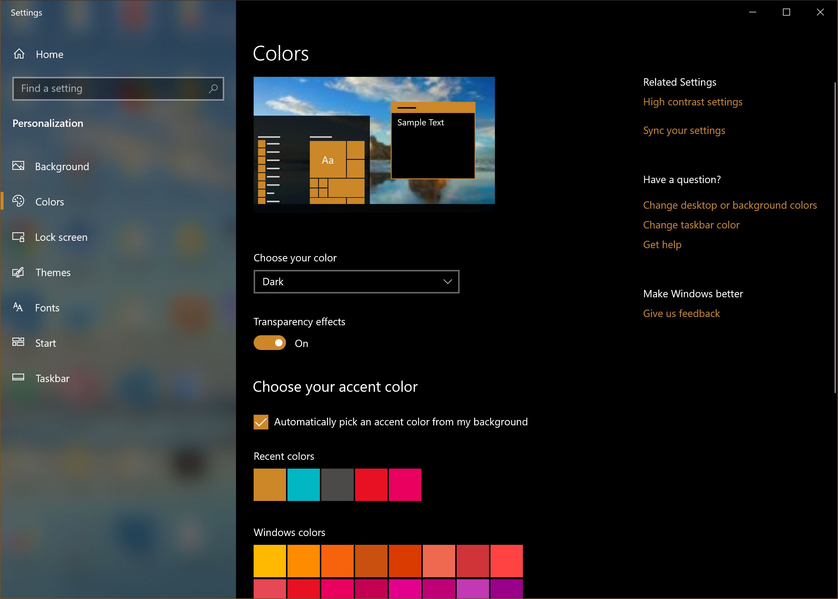
Windows 10 Dark Mode Setting
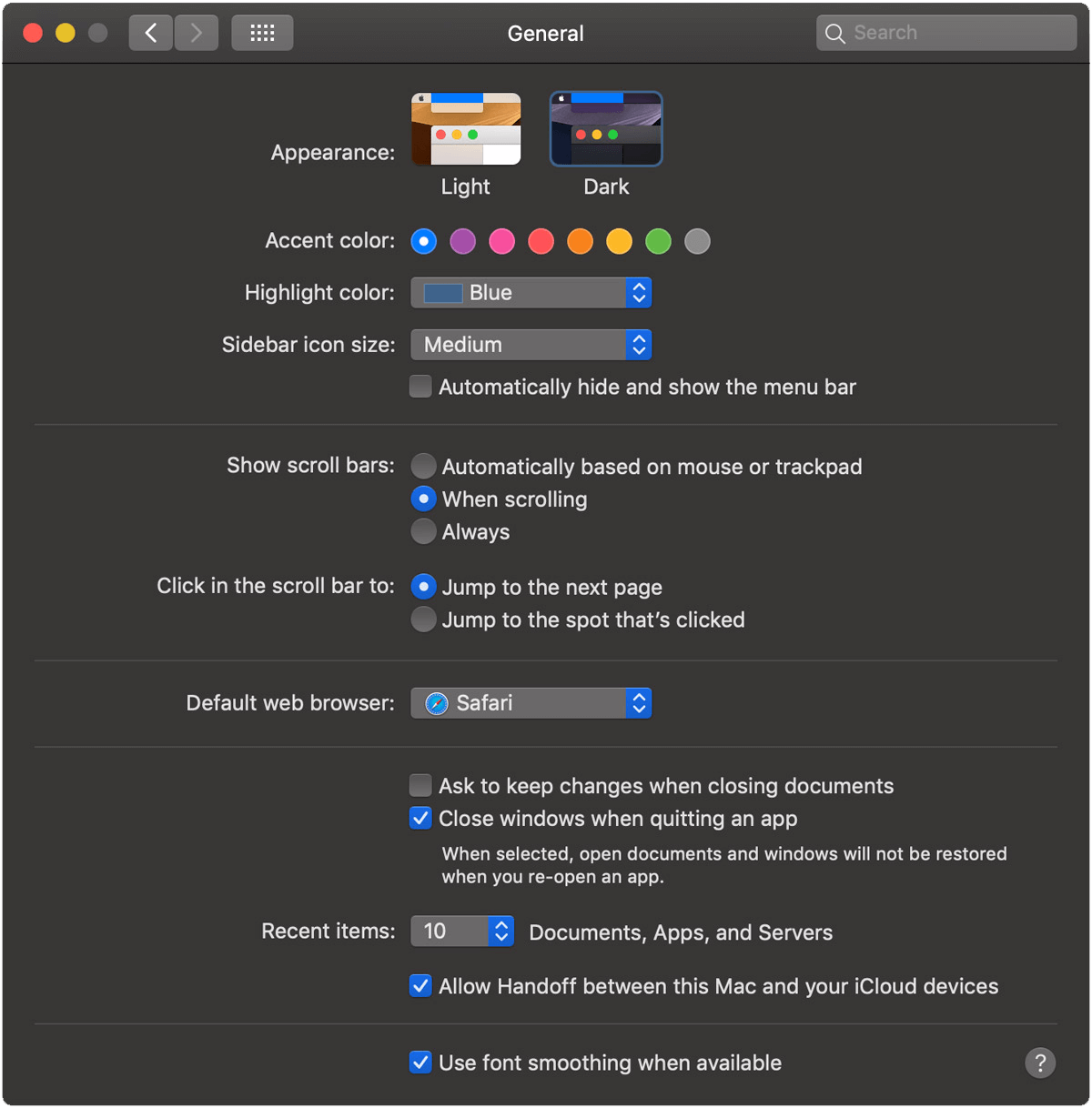
macOS Mojave Dark Mode Setting

Android 9.0 Dark Mode Setting
Utilizing the UI props to add a custom fixed header, absolutely positioned footer and left/right arrow buttons and absolutely positioned image overlay component
README.md
Windows 10 Dark Mode Setting
macOS Mojave Dark Mode Setting
Android 9.0 Dark Mode Setting
Installation
This library is built with hooks and requires React >= 16.8.0 and styled-components >= 5.0.0

Basic Usage